Mojo
I helped the Mojo team design a desktop version of their app, so mobile users could manage their content across devices.
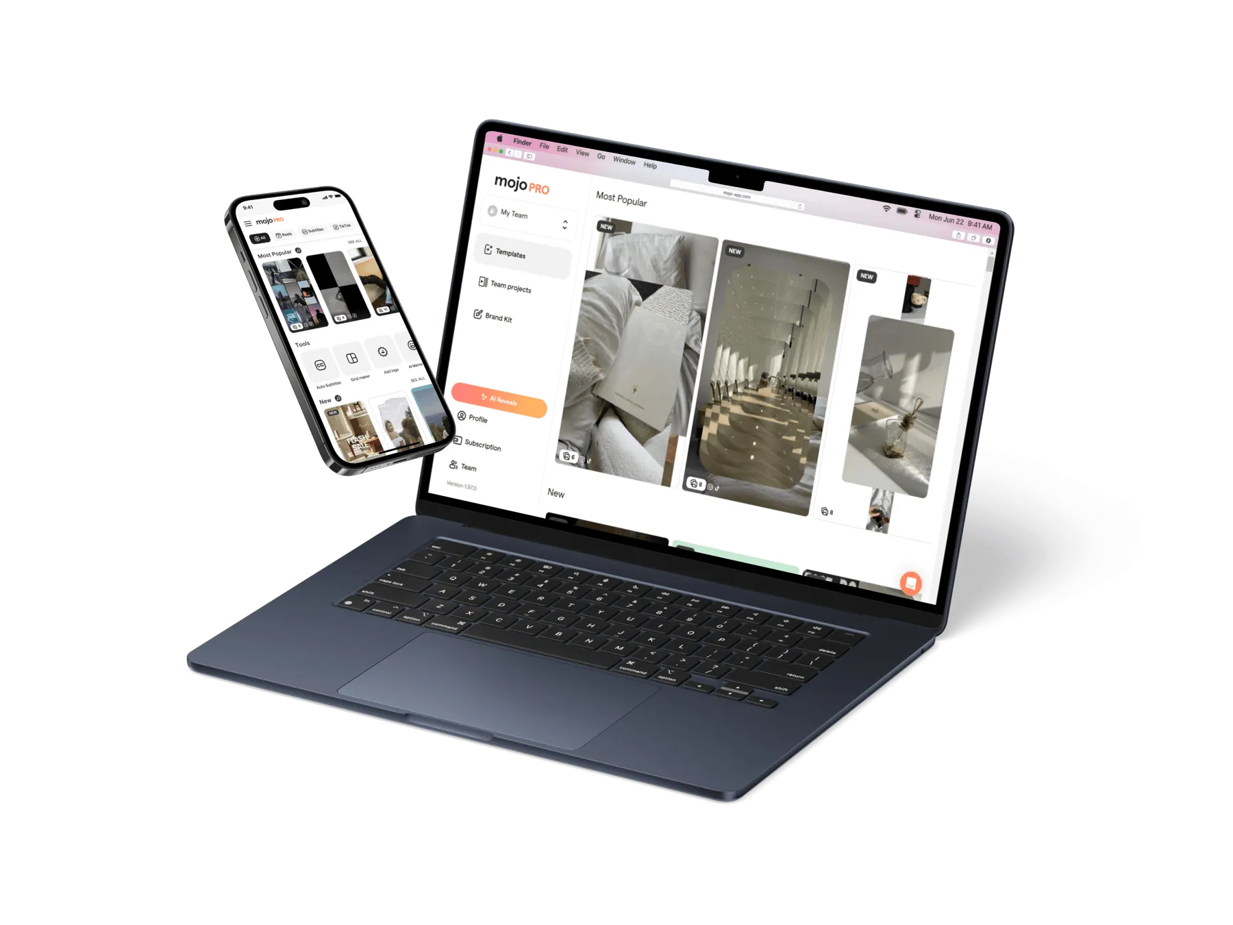
A mobile-first product, growing up.
Mojo built its name on fast, template-driven video creation on the phone. As creators leaned on it for more of their content, the phone-only workflow started to strain: managing a growing library, fine-tuning designs and posting across platforms is work that wants a bigger canvas.
I was brought in to shape a desktop experience that let existing mobile users pick up their content on a larger screen without relearning the product.
Continuity across devices, not a second product.
The risk with a desktop version is building a parallel app that feels foreign. The core challenge was translating a touch-first, single-column interface into a desktop layout that used the extra space for real leverage (library management, multi-panel editing) while keeping the mental model identical.
Map the flows, extend the system.
I started from the existing user flows and the mobile design language, then extended the design system to desktop: new layout grids, navigation patterns and denser content views that still spoke the same visual language. Research fed the priority calls on what belonged on desktop first.
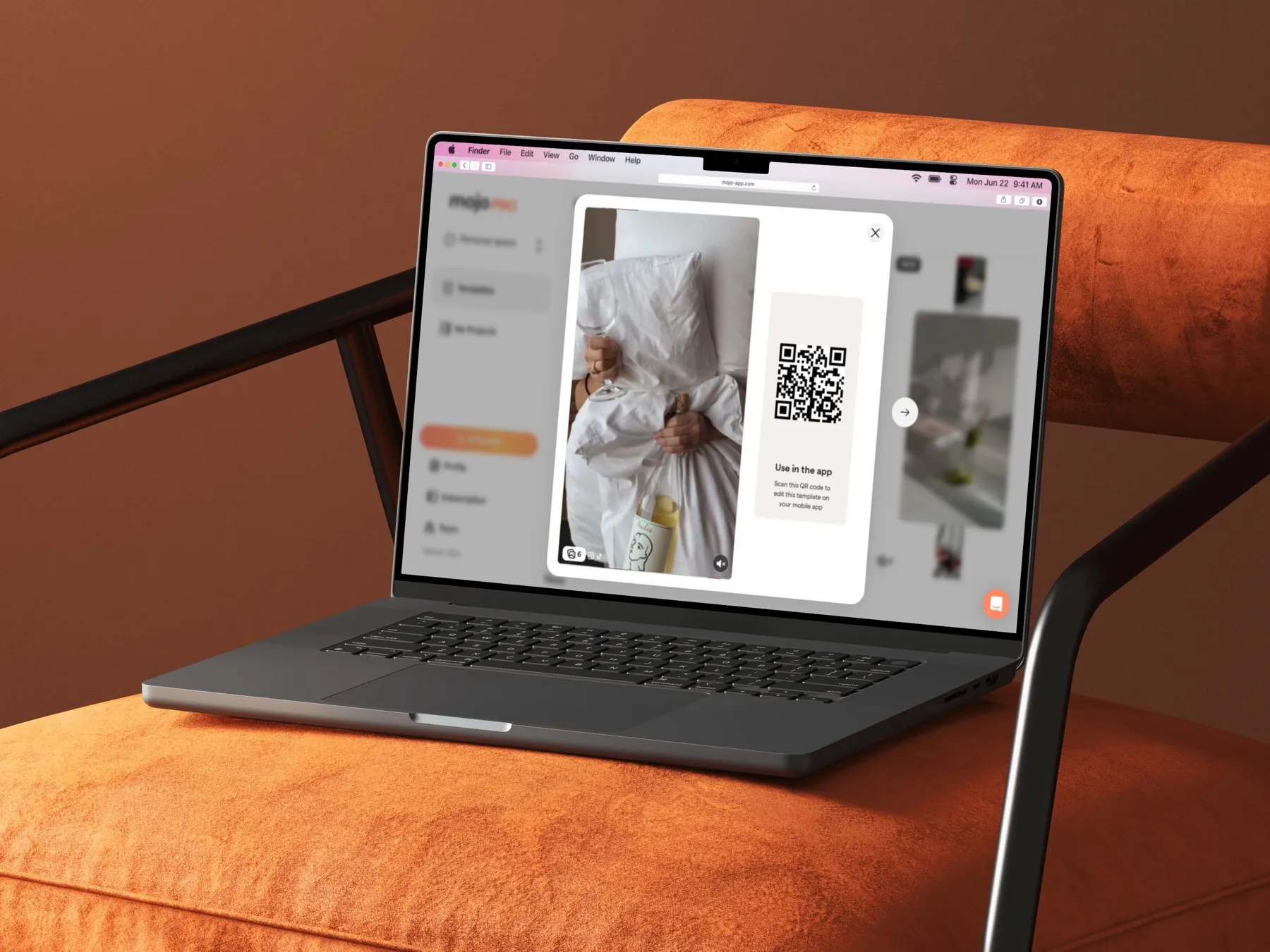
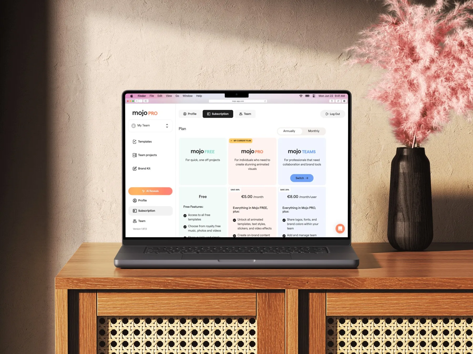
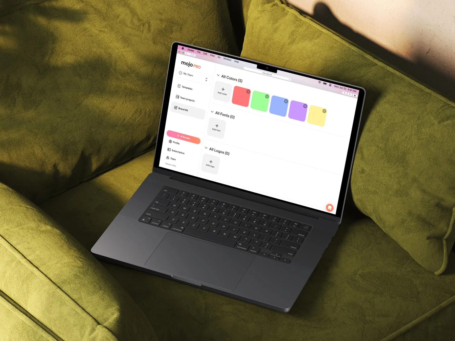
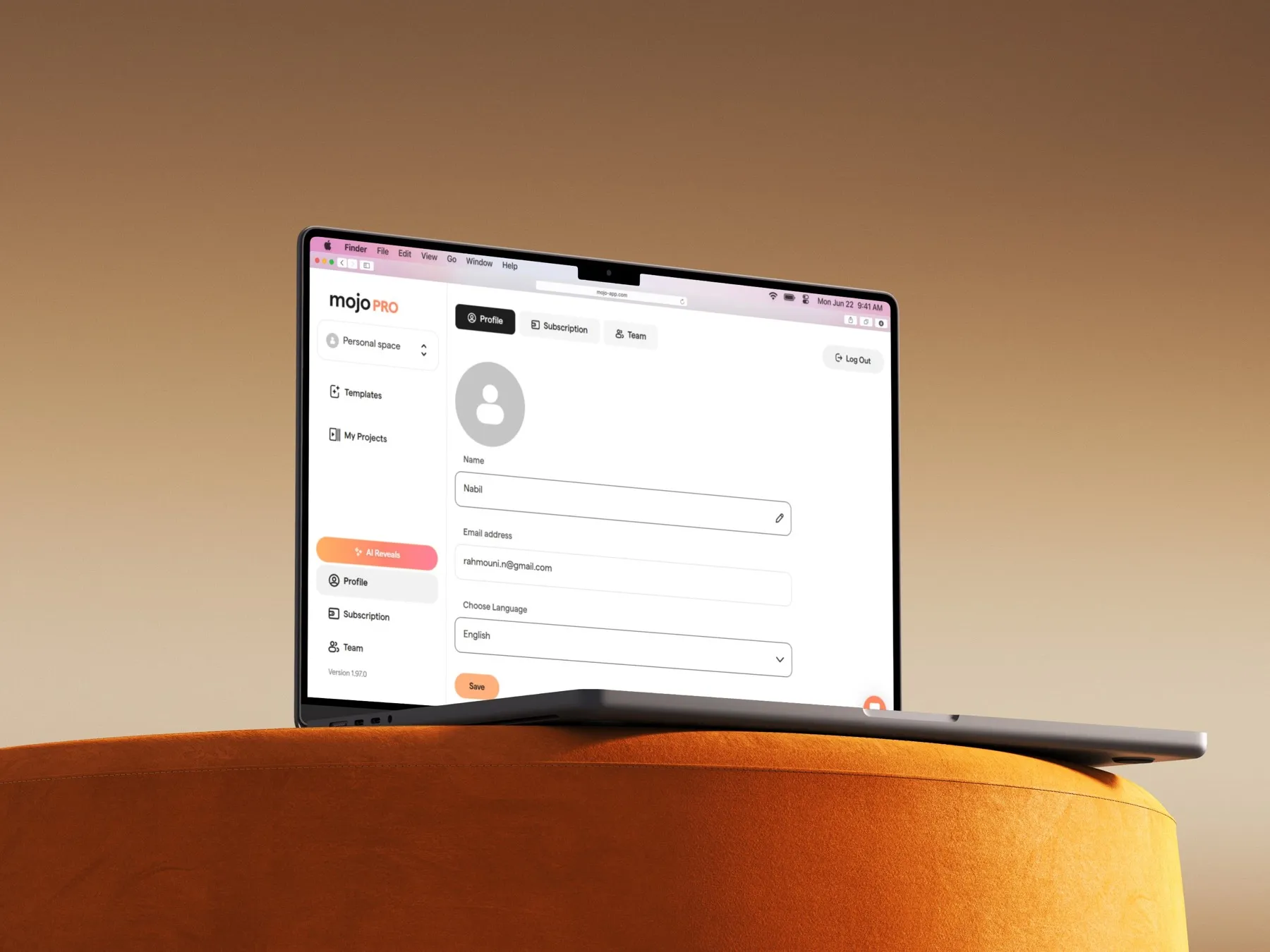
A desktop Mojo that feels like Mojo.
The result is a desktop experience that mobile users step into without friction, with the room to manage content across devices.
[ADD METRIC — e.g. adoption of desktop, retention or task-completion change]